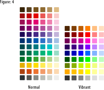
Oxygen has one color palette with two parts. “Normal” colors have sober tonalities of the most needed colors. These are used mostly for mimetypes, folders, system applications and actions. Vibrant colors are more saturated used to emphasize important action icons on a toolbar, for rich media mimetypes, for application icons and, generally speaking, used when there is need to focus the attention of the user on a particular element, helping the user to find his way by following a “subliminal” color language.
 To download the Oxygen color palette for the Gimp: right click this link, then click Save As. To use this palette in Inkscape:
1) In your .inkscape folder make another folder called palettes.
2) Put the oxygen.gpl file in that folder.
3) Restart Inkscape
4) Select the Oxygen palette in the Swatches
dialog (Ctrl+Shift+W).
The Oxygen color palette is released under the Creative Commons Attribution-NonCommercial-NoDerivs 2.5 License. Thanks to Nuno Pinheiro for giving us permission to publish the Oxygen color palette on this site.
Read More....
|

This is something I didn't knew at all; but while reading twice the post I realized my brain did already recognized these two kind of palettes while the inner me was pondering about it.
That's pretty true, the vibrant one catches more in certain fields and I think I will consider this hardly in the new KVIrc palette.
Thanks for posting it =)
eth*
---
I don't have an attitude problem, you have aperception problem.